CONSEQUENCES - CIRCLE BY CIRCLE
The next row has three circles backed with white cotton fabric, hand quilted with white quilting thread. The pattern of flowers, vines and leaves was made in careful small stitches.
'FAMILY' Reading left to right, the family is first. The colours of each circle were chosen to compliment the subject of the circle. Black and gold squares are placed where the circles intersect. As with each level, the lettering style is meant to reflect the meaning of the words. The lettering was drawn with fabric pens. 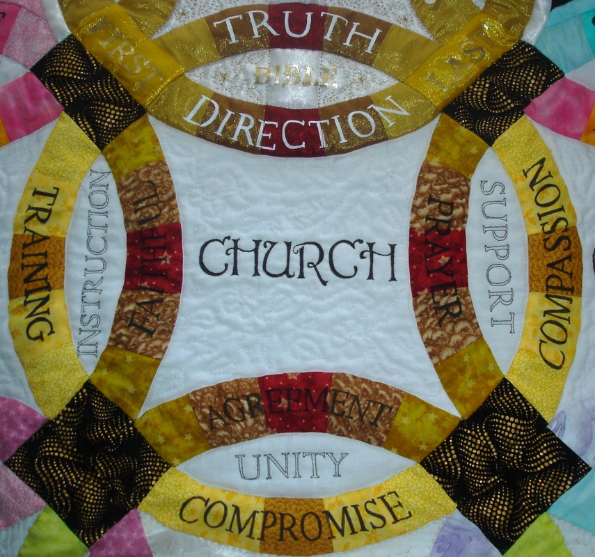
'COMMUNITY' is the last on this row. Positive words which suggest the best of community life are used. 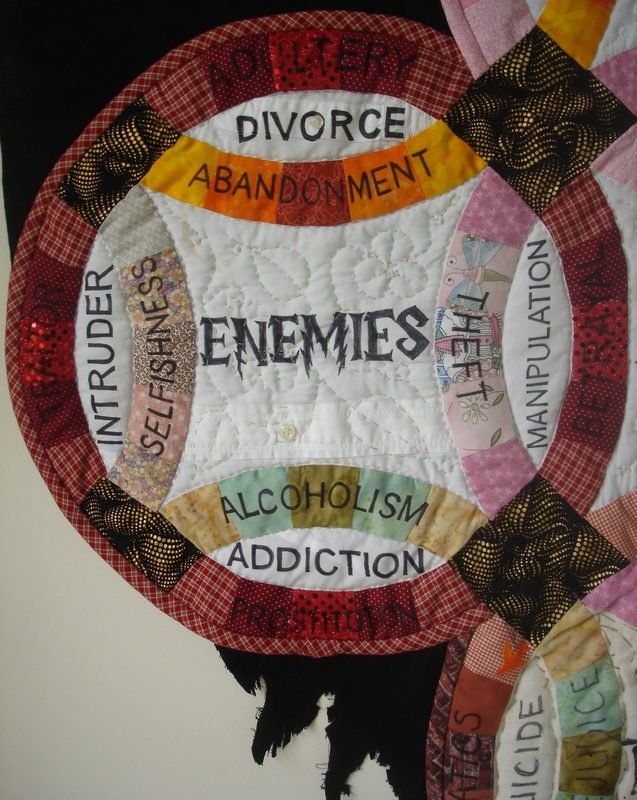
Closer to family and nearer the centre there are 'AQUAINTENCES'. (yes yes I know the word has a 'c' in it. Some acquaintances are more perfect than others.) On the word melon 'activity' we can see some of the satin found on the inside yoke of this shirt. Odd that. Didn't realise the satin was there until I cut it up. 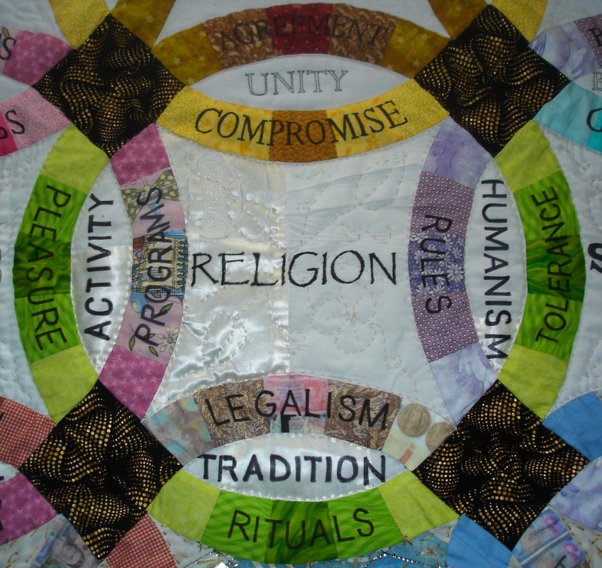
'SOCIETY' is the forth in this row. This is a real mix of the good and bad...just like the real world. 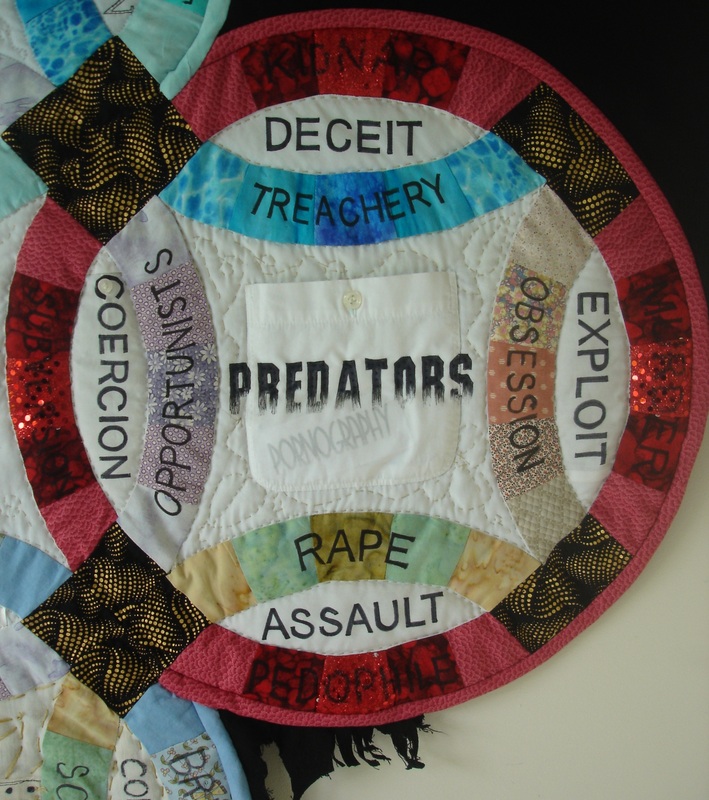
'TERRORISM' is the first circle on the forth row. There are three circles on this row. The fabric used for the background is an antique flour sack.
The spots are human blood (contributed by myself and another volunteer) ironed and washed to kill any pathogens. Stitched with synthetic sinew, the pattern is disrupted and awkward. The wording is warped, and the binding slashed. (I had my children write some of the words). On the connecting black squares, the gold has been damaged using fingernail polish remover. 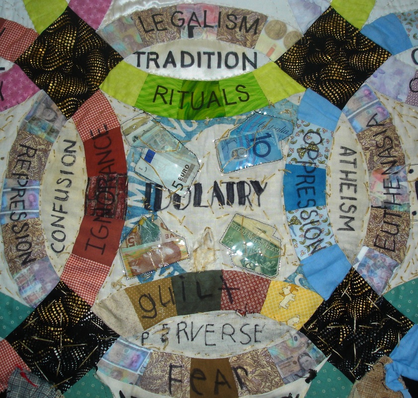
'GOVERNMENT/POLITICS' had a sad moment. I did not have enough fabric left from the flour sack to make a spare centre. I put the word 'government' in the centre, but made it crooked...as in crooked government.
My husband commented that it wasn't straight. I explained and he thought it wasn't crooked 'enough' to be apparent. He also pointed out that government itself wasn't a problem, that politics would be more appropriate. FINE. Got it. The apparent problem was solved by stamping politics over government. Afterwards I found the effect appealing in some twisted way. Thankfully in this quilt there was no right or wrong way to express concepts. 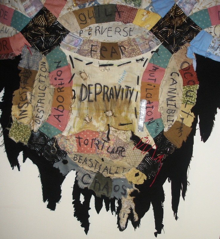
|
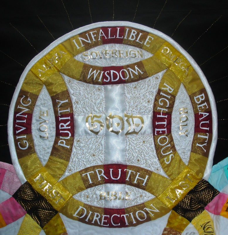
'GOD' Until 'Consequences' my quilting had been predictably traditional. This art/statement quilt caught everyone (including me!) off guard.
Although I still ADORE traditional quilting, my artistic side had a way to express itself. This TOP circle was made from satin left over from a wedding dress and dupioni silk fabric, the gold letters were direct appliqué lame. (pronounced lah-may) The colours reflect both royalty and blood. This circle was hand quilted with gold thread. The white words painted with acrylic paints. The quilting was absent in the middle - accentuating the cross. The area above the 'quilt' is a piece of black fabric, without batting. Tiny rays of gold thread spike out from the top circle. 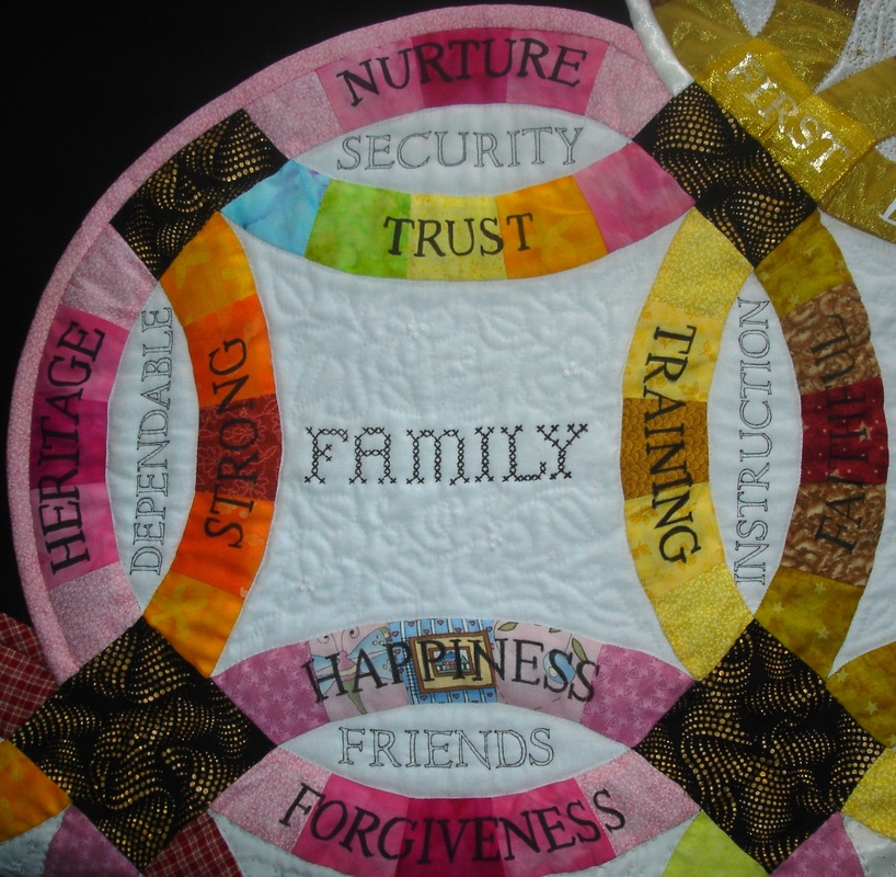
'CHURCH' In the centre of the second row, is the circle of 'church'. In colour the 'church' is a reflection of the top circle "GOD" using cotton fabrics. 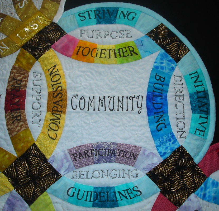
Moving to the third row down we come to a less elegant fabric. The background is an old cotton work shirt, complete with stains, pockets and buttons.
'ENEMIES' - is the first of five circles in this row. This level represents humanity in it's seedier form. The hand stitching is the same design as the rows above but more crude, with a darker thread. Words become less tidy, the meanings darker. At the bottom of this circle the fray is beginning to show. Uglier fabrics are introduced, as well as a lack of harmony in the colours. 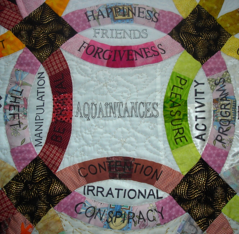
In the middle of this row 'RELIGION' appears. It imitates the top circle with it's shiny self (half)...but fails. A friend (Julie), pointed out the name-brand on the satin which reads 'gentleman's breeches', thinking I was trying to be even more obtuse. Nope, that was a freebie. Honestly hadn't noticed... 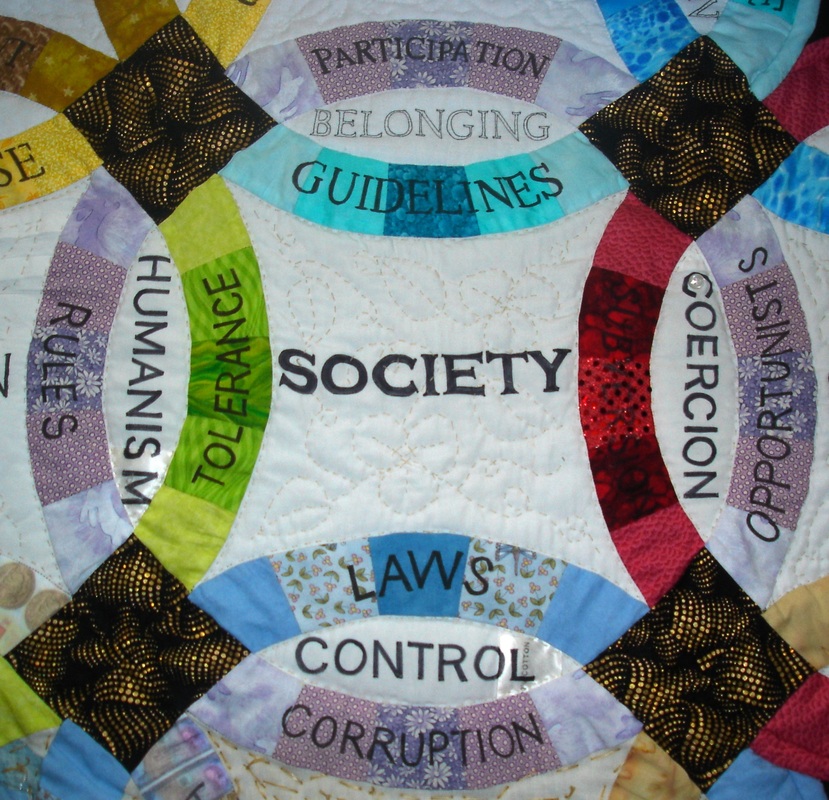
Last on this row is 'PREDATORS'.
The paper inside the pocket is glued to the front so that it can be easily read. Like the 'enemies' circle this is on the farthest edges. Some of the fray is visible below. 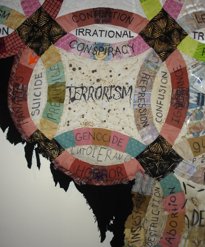
'Idolatry' is the centre of this row.
Euro, Australian, Kiwi and USA bills are shown. It apparently is illegal to pierce or damage paper currency so plastic was laid over and sewn around the bills. The print from the flour sack is easily seen. 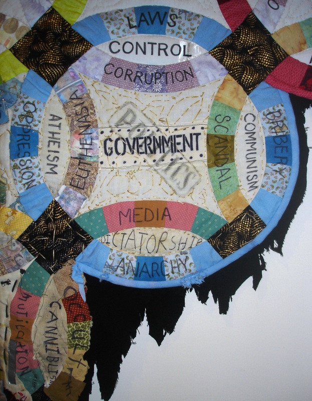
'DEPRAVITY' Well this was my most extreme quilting moment. Yes, that shiny stuff is duct tape. (sewn on so it didn't accidentally peel off)
Black chord, weird threads and staples create a cacophony of visual confusion. The blue stitches are actual sutures begged from the emergency department. (Thank you sweetheart for breaking your leg for my quilt). The staining is blood (steak this time) and ground in charcoal. Well-ironed then washed to ensure no pathogens and no staining the rest of the quilt... the burned holes had to be drawn around with a brown marker because the burned cotton all just dissolved. The dirty cotton batting that is hang out is just added for effect. There are backwards sewn seams. Finishing the edges so no threads made a mess was a little tricky, but the over-all effect hit the mark. |